Latest News
- 7.6 magnitude earthquake hits northern Japan, triggers tsunami
- New competition in Hollywood: Paramount's direct attack on Warner Bros.
- Ottawa announces new measures to speed up admission of foreign doctors to Canada**
- Air Transat pilots protest; some flights suspended from Monday
- Canadian surrogate mother turned back from US border; barred from travel for infertility treatment
Latest Ads
-
Jasmine Jewel
Call

-
Omidan group
Call

-
Amir Madanpour
Call

-
Dimo studio
Call

-
Yorkacademy
Call

-
Maryambagheri
Call

-
Shishlix Restaurant
Call


 256 View
 182 View
 240 View
 206 View
 138 View
 614 View
 231 View
 810 View
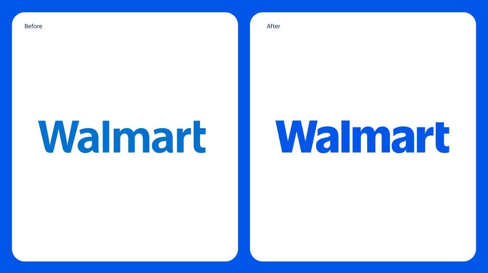
Walmart's logo got its first facelift in nearly 20 years
Walmart has introduced its new logo, which is the first change in almost 20 years. These changes subtly refer to the brand's past. The logo uses a thicker font than the previous version and is inspired by the typeface that the company used in the 1980s and early 2000s.
In the new design, the yellow "spark" symbol usually seen next to the logo is retained; But a darker blue color has been introduced to update the brand. The logo will appear on Walmart's website and app starting this month, and will gradually be applied to the company's 10,500 stores, which are themselves undergoing renovations.
The changes come at a time when Walmart's sales are growing. Its U.S. store sales were up about 5 percent last quarter from a year ago. The company has been able to attract customers with higher incomes by investing in the food sector and using its huge scale to reduce prices in the context of historical inflation. It has also increased its sales in the US by 22% by strengthening its online operations against Amazon.
news source
Suggested Content
Latest Blog


Login first to rate.
Express your opinion
Login first to submit a comment.
No comments yet.